User interface
Overview
Material Maker mainly consists of 3 panes:
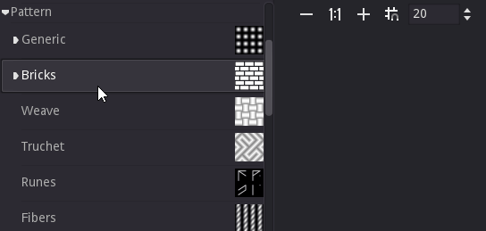
The top left pane is the library, that contains all available nodes that can be used to create materials. Library items are shown in a tree view
The bottom left pane is the preview, that shows at the same time the current material applied to a sample mesh in a sample environment, and the texture generated by the currently selected node
The right pane contains the graph editors where materials are described for current projects
First steps with the user interface
When opening Material Maker, a new empty project is created and shown in the right pane. An empty project simply consists of a material node where textures for all elements of the material should be connected.
To create a new node, simply choose one (for example “bricks”) from the library (the top left pane) and drag it into the graph editor. Depending on the selected library item, a preview or a simple description will be displayed while dragging.
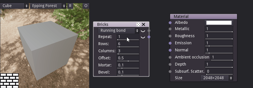
Selecting this new node (by clicking on it) shows it in the preview pane. The very small 2d preview of the preview pane can be maximized by double clicking on it. This will hide the 3d preview but is useful when working on the different textures of the material.
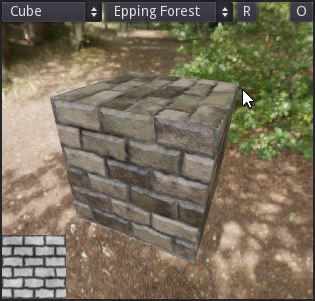
To connect a node output to an input of another node, simply drag one to the other. For example we can drag the first output of the Bricks node to the albedo input of the Materials node. This will automatically assign the simple Bricks texture to the albedo element of the material, and the 3d preview will immediately be updated (if you maximized the 2d preview it can be minimized by double-clicking on it again).
Nodes can also be disconnected by dragging a connected input away from its node.
Nodes can easily be configured by modifying their parameters, and previews are updated automatically.
Since each input can be connected to a single output, reconnecting an input will automatically remove the previous connection.
Graph pane
The graph pane is where materials can be edited, by adding and configuring nodes, and connecting them.

Grid and zoom
In the top left corner of the graph pane, the following buttons can be used to modify the zoom level and configure the grid:
the
button zooms out.
the
button resets the zoom factor.
the
button zooms in.
the
button toggles the grid. When moved, nodes will stick to the grid when it is active. The grid size can be modified using the spinbox next to the grid button
The view can be centered using the View -> Center view menu item or the C shortcut, and the zoom factor can be reset using the View -> Reset zoom menu item or the Alt-0 shortcut.
Material navigation
In the top right corner of the graph pane, the graph navigation button
 can be used to show a tree view of the material.
Double clicking on an item in this tree will show it in the graph view.
can be used to show a tree view of the material.
Double clicking on an item in this tree will show it in the graph view.
When a subgraph is shown in the graph pane, additional items are visible in the top right corner:
a text entry shows the name of the subgraph and can be used to modify it.
a
 button to decide if the current subgraph transmits
its random seed to its children.
button to decide if the current subgraph transmits
its random seed to its children.a
 button to move to the parent of the currently shown subgraph.
Selecting and copying nodes
Clicking on the title bar of a node will select it. Selecting a node will show its first output (if any) in the 2D preview. It is possible to select several nodes by holding the Control key while selecting.
Selected nodes can be copied using the Edit -> Copy menu or the Control+C keyboard shortcut. They can also be cut using the Edit -> Cut menu entry or the Control+X shortcut. Both operations store the selected nodes and their interconnections in the clipboard. Note that the format used is JSON, and nodes or group of nodes can easily be shared using this format.
The contents of the clipboard can be pasted into a graph using the Edit -> Paste menu or the Control+V keyboard shortcut.
Library pane
The library pane shows all nodes defined in both base and user libraries in a tree view. The base library is provided with Material Maker and the nodes it contains are documented in this manual. The user library contains all nodes that were added using the Tools -> Add selected node to user library menu item.
The filter field above the library tree can be used to quickly find a specific node. The tree will be updated whenever the filter string is modified. It is possible to give focus to the search field using the Control+F keyboard shortcut.

Preview pane
The preview pane shows a 3D preview of the material, and a 2D preview of the first output of the selected node.
The left select button can be used to select a model for the 3D preview, and the second one provides different environments. The R button can be used to start and stop the object’s rotation animation. Pressing the O button will show the 3D preview as background of the graph pane.
In the 3d view, the object can be rotated about the yaw and the pitch axes (from the camera’s point of view) by holding the right mouse button and moving the mouse horizontally or vertically. The object can also be rotated about the roll axis by holding Shift and and the right mouse button and moving the mouse horizontally.
Holding the left mouse button will rotate the camera while the object remains static.
Rotating the object or the camera will automatically disable the object’s rotate animation.
The mouse wheel can be used to move the camera along its longitudinal axis (hense zooming forward or backward).
Clicking on the 2D preview will minimize or maximize it.